
Digital Shadows
Branding for security isn’t about looking “tough.” It’s about looking trustworthy, clear, and technically competent.
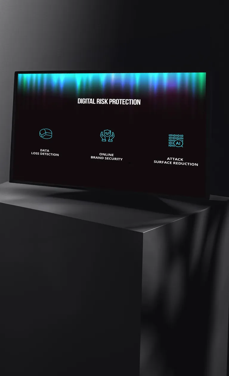
Problem
Security brands often lean into clichés—locks, shields, “hacker green.” The better route is confidence through restraint: strong typography, consistent color logic, and clean layouts that feel modern and calm.

Touchpoints
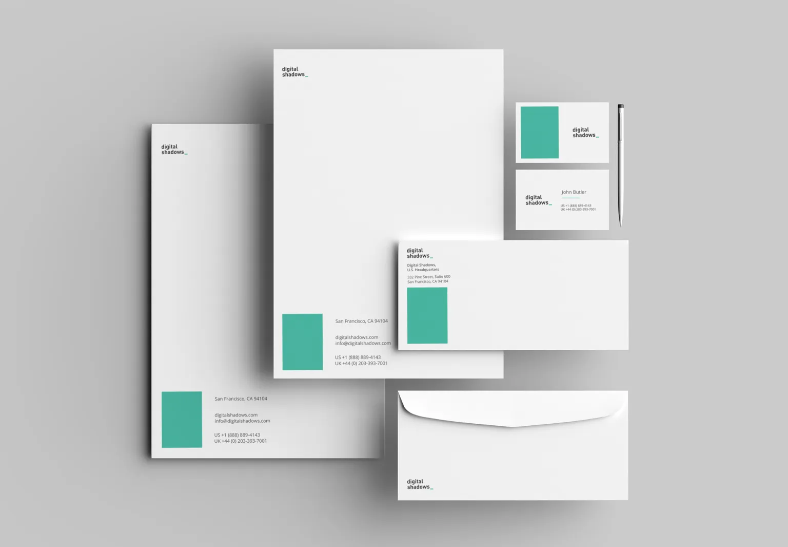
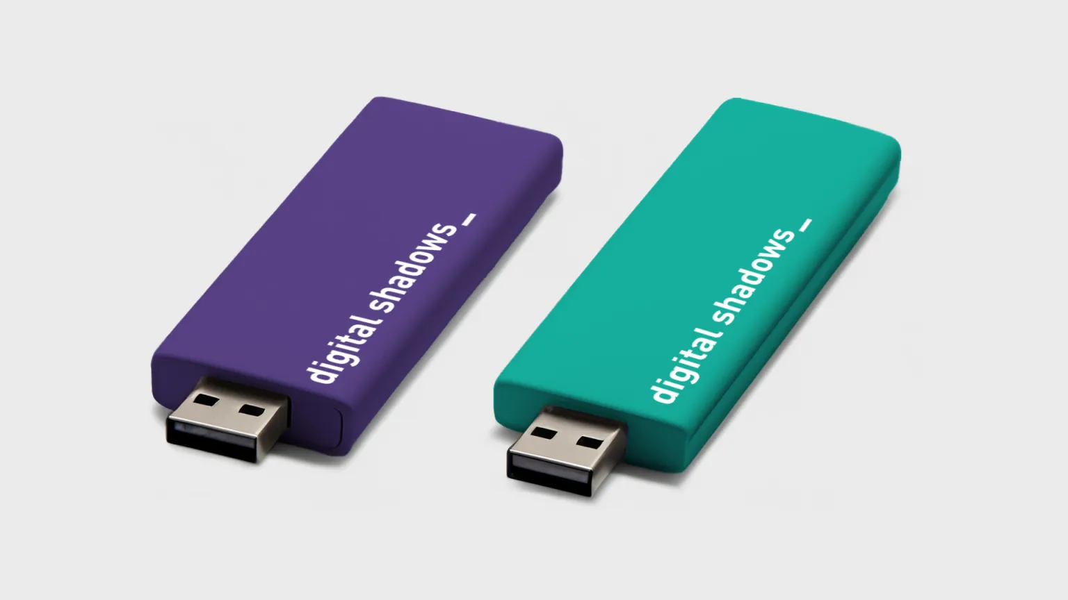
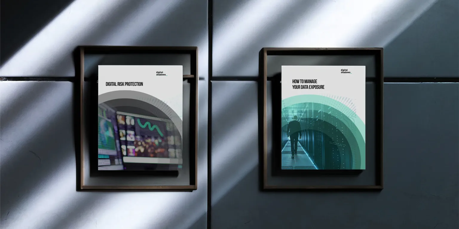
The test of a brand is how it behaves on the everyday stuff: business cards, letterheads, small objects. Here the system stays tight across materials and backgrounds.

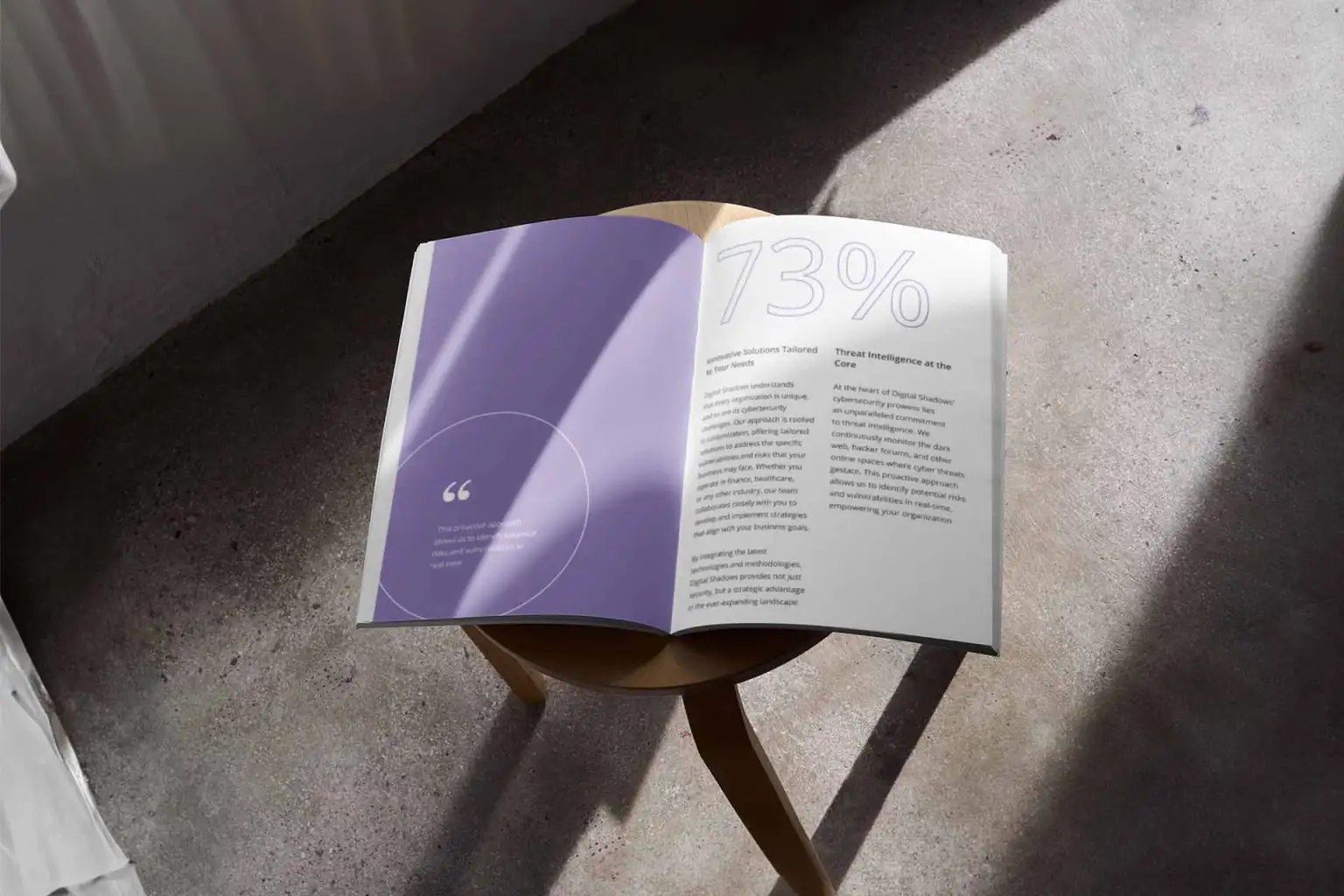
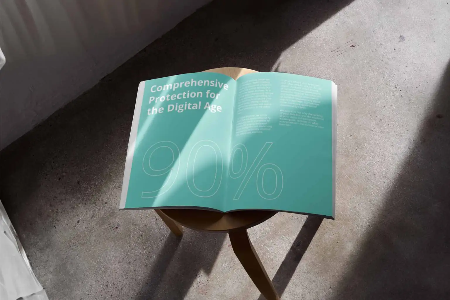
Editorial spreads
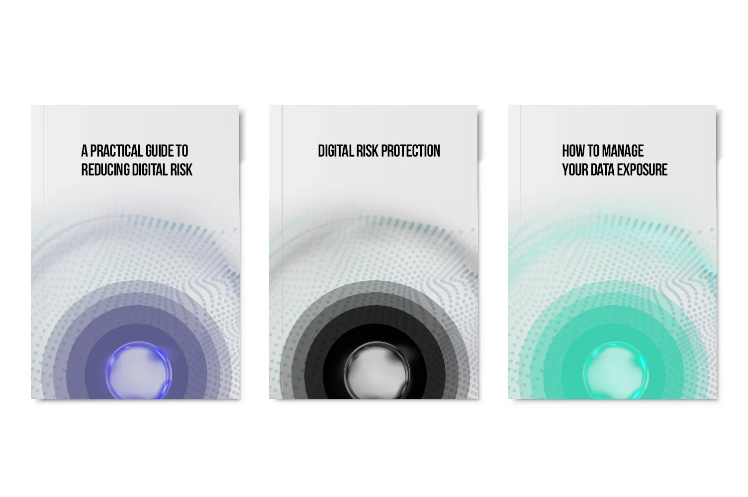
Spreads reveal thinking: sequencing, pacing, and the ability to make information feel designed. These layouts prioritize legibility first—then style.

Outcome
The final system communicates “secure” through clarity and structure. Instead of relying on tropes, the identity earns trust by being consistent everywhere.
Visual reference source: ArtVersion Digital Shadows showcase.