
Marlowe Fine Art
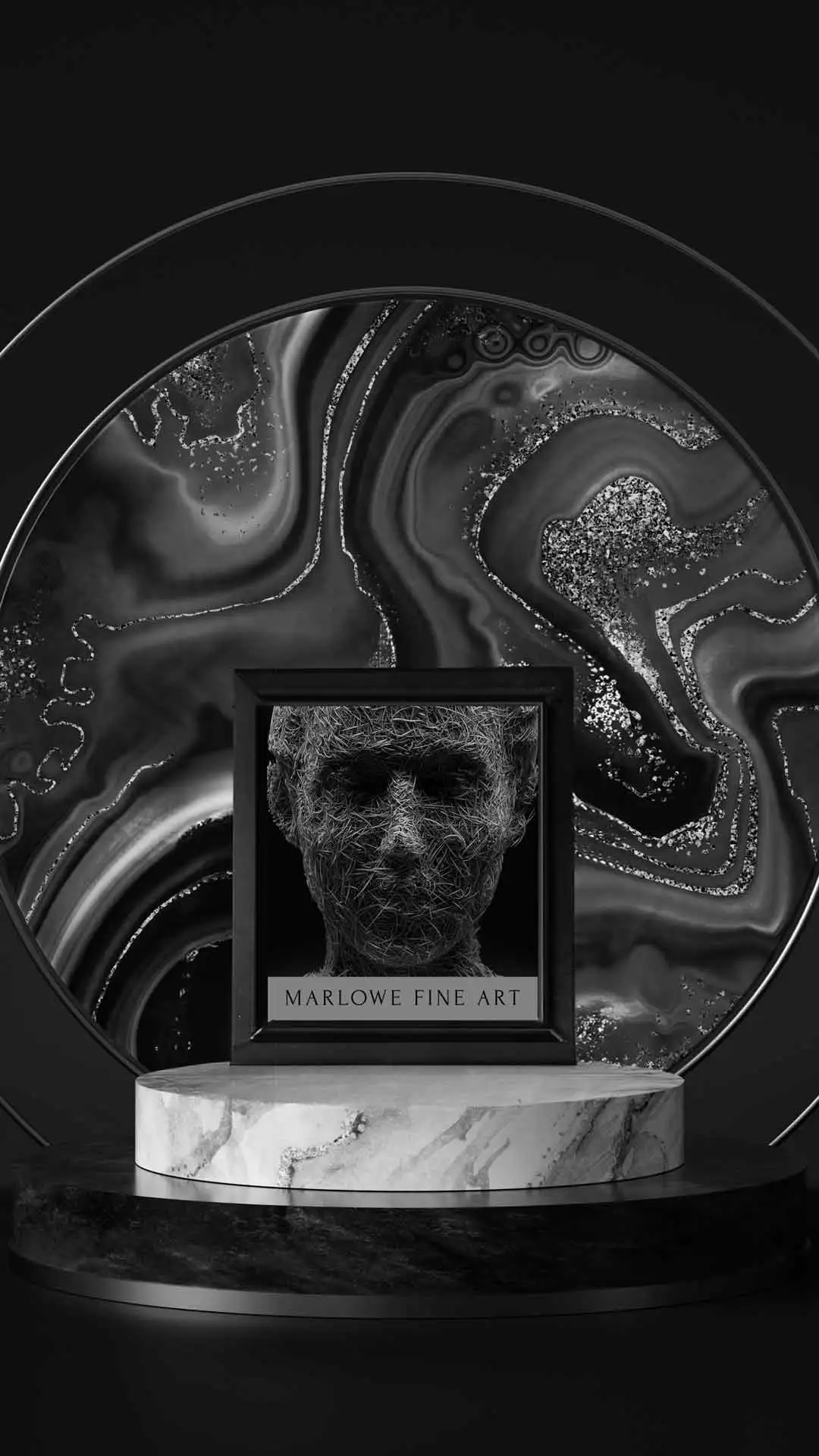
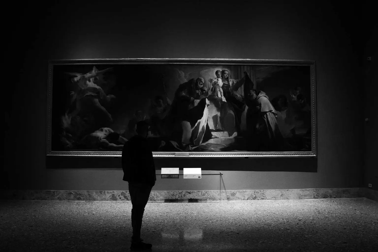
Fine art branding should feel like a gallery: intentional spacing, confident typography, and visuals that don’t fight the work.
Intent
The visual language here is about restraint. The system gives art space to exist, and the brand supports that with consistent grids, refined type, and high-quality presentation.
Print system
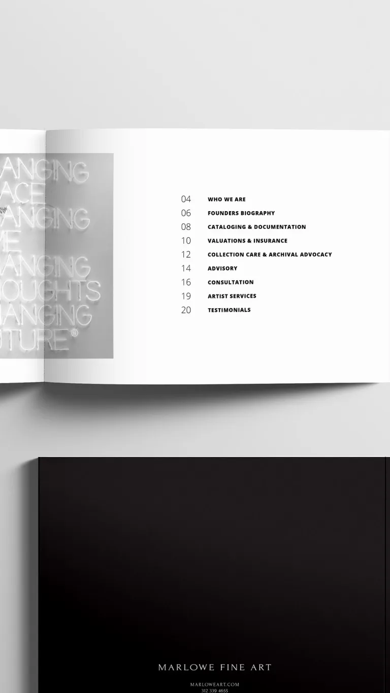
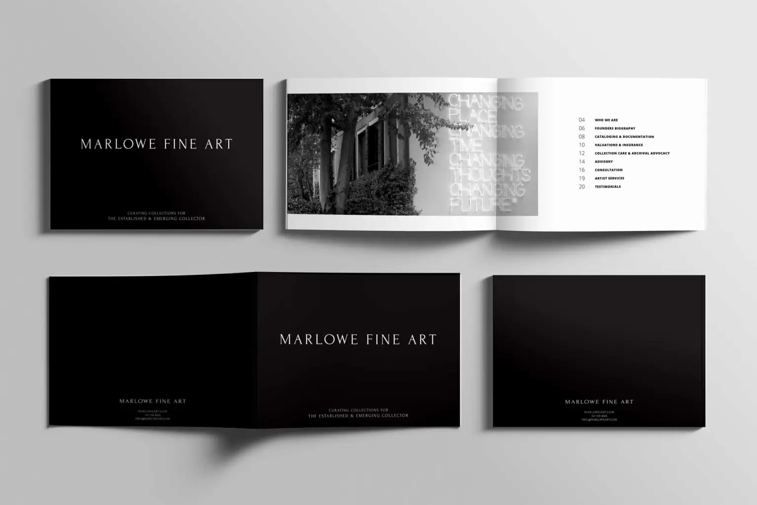
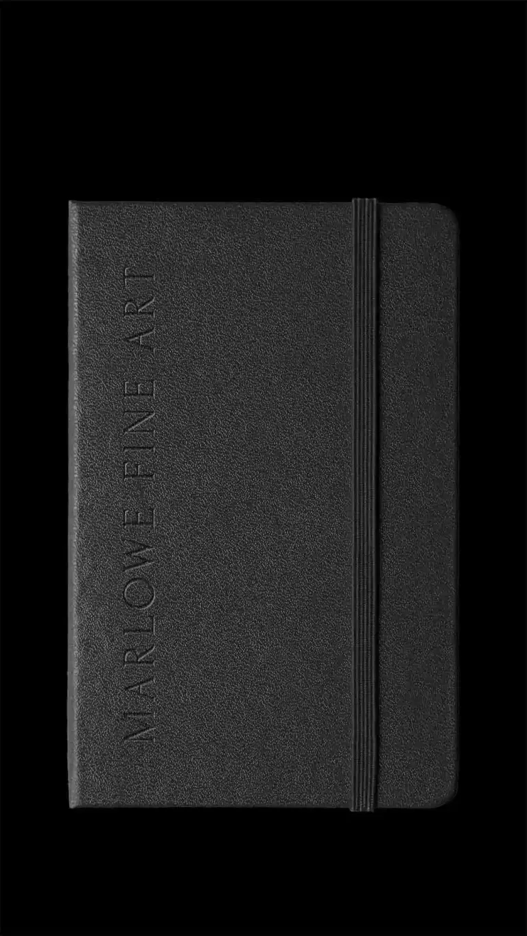
Catalogue work is a test of layout discipline: margins, type scale, pacing. The spreads below show consistent hierarchy and a clean reading experience—like walking a gallery wall.
Environmental + promo
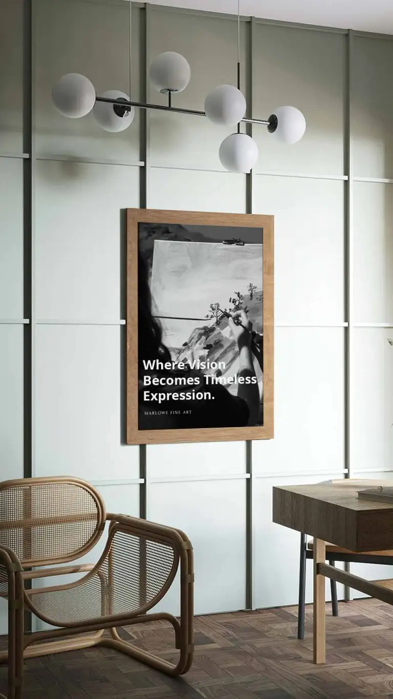
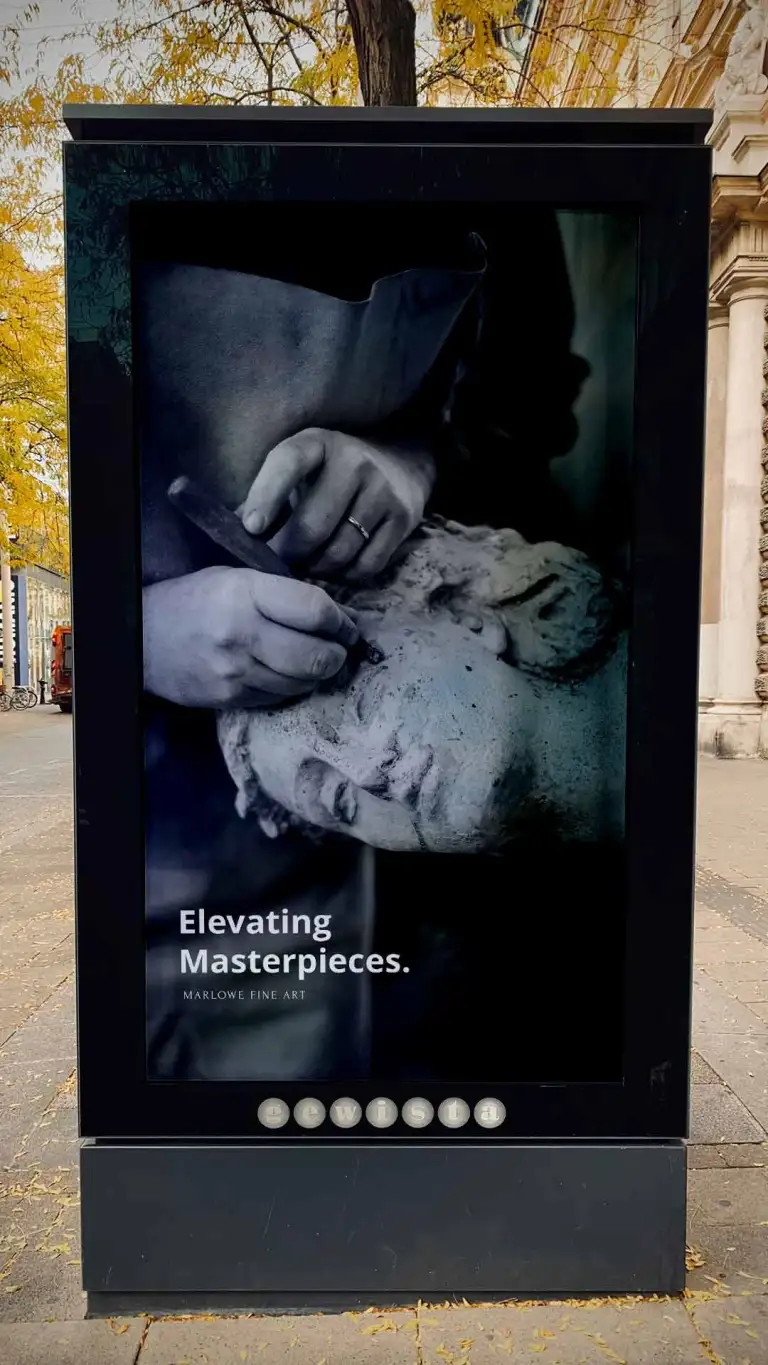
Fine art brands still need visibility—signage, posters, placement. The system stays consistent across formats while keeping attention on the artwork.
Outcome
The system reads as elevated and consistent across motion, print, and environment. The takeaway is control: typography, spacing, and image treatment all work together to feel gallery-grade.
Visual reference source: ArtVersion Marlowe Fine Arts showcase.