
Mood Harbor
A research-driven emotional wellness companion designed to help people build a sustainable check‑in habit through lightweight interactions, clear insights, and emotionally safe design.
Overview
Mood Harbor explores how a digital product can support everyday emotional wellness—not clinical mental health—by meeting users where they are: busy, overwhelmed, and often disconnected from how they feel. The project focuses on understanding emotional rhythms, identifying friction points, and designing a check‑in experience that feels supportive rather than demanding.
Problem
Most mood‑tracking apps fail because they ask users to do too much emotional labor at the wrong time. Through early research, it became clear that people don’t struggle with understanding their emotions—they struggle with remembering to check in, finding the right moment, and avoiding guilt when they “fall off.”
The initial prompt (“track your mood”) wasn’t enough. The real challenge was:
How might we help people build a gentle, sustainable emotional check‑in habit that fits into real life?
Research Approach
To understand how people move through their days emotionally, I conducted:
- 6 semi‑structured interviews
- Journey mapping of daily stress patterns
- Behavioral modeling to identify triggers and coping loops
- Competitive analysis of mood and wellness apps
- Affinity mapping to synthesize themes
 (2).png)
Key Insights
- Emotional peaks are predictable: mornings (rush), midday (overload), evenings (crash).
- People want support, not self‑diagnosis: anything clinical or judgmental creates resistance.
- Reflection must be lightweight: long journaling is valuable but unrealistic most days.
- Patterns matter more than entries: users want trends, not logs.
- Consistency must be rewarded gently: guilt destroys habit formation.
Journey Mapping
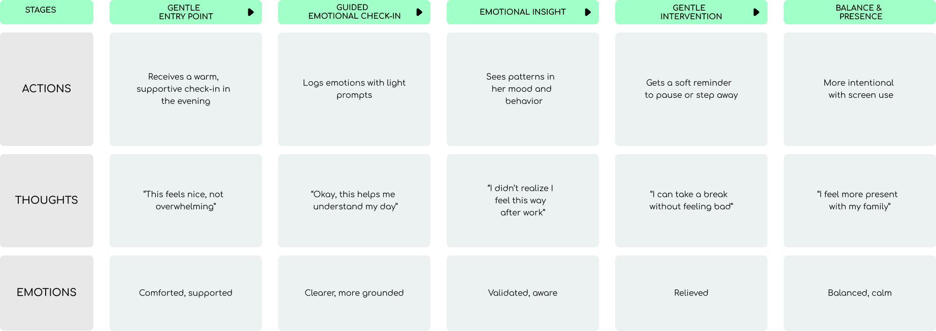
Journey mapping helped clarify how emotional patterns unfold across the day and where small, well‑timed interventions could make the biggest impact. Below are current‑state and future‑state journeys for both Marcus and Danielle, showing how the product reframes their emotional routines.
Marcus — Current State
.png)
Marcus — Future State
.png)
Danielle — Current State
.png)
Danielle — Future State
Personas
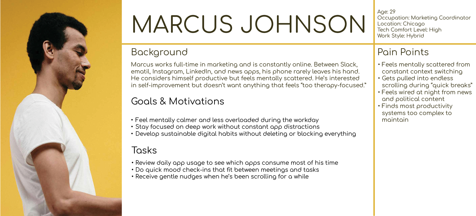
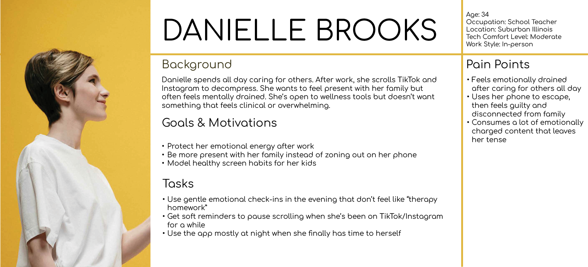
Two personas emerged from synthesis: an overloaded achiever and a quiet internalizer. Both want emotional support, but neither wants to feel judged or monitored.
Behavioral Models
Mapping thoughts, actions, and emotions across the day revealed triggers, coping strategies, and emotional loops that informed the structure of the check‑in flow and insights.
Reframing the Problem
After synthesis, the design challenge became:
Design a check‑in experience that feels small, supportive, and repeatable — even on difficult days.
This shifted the product from “track your mood” to helping users notice patterns, reduce emotional friction, and celebrate consistency without guilt.
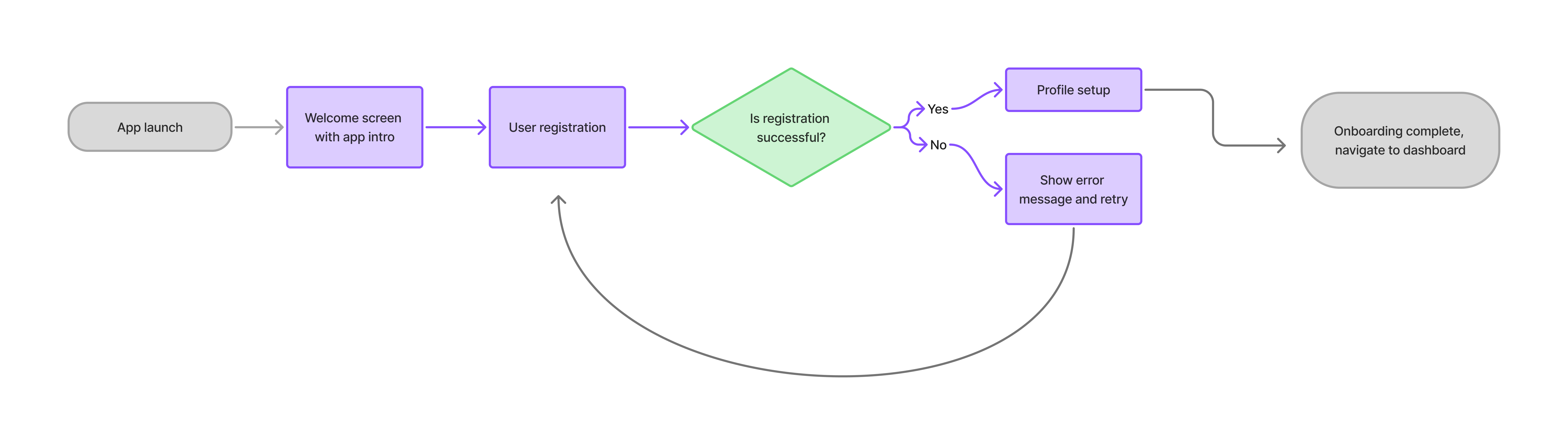
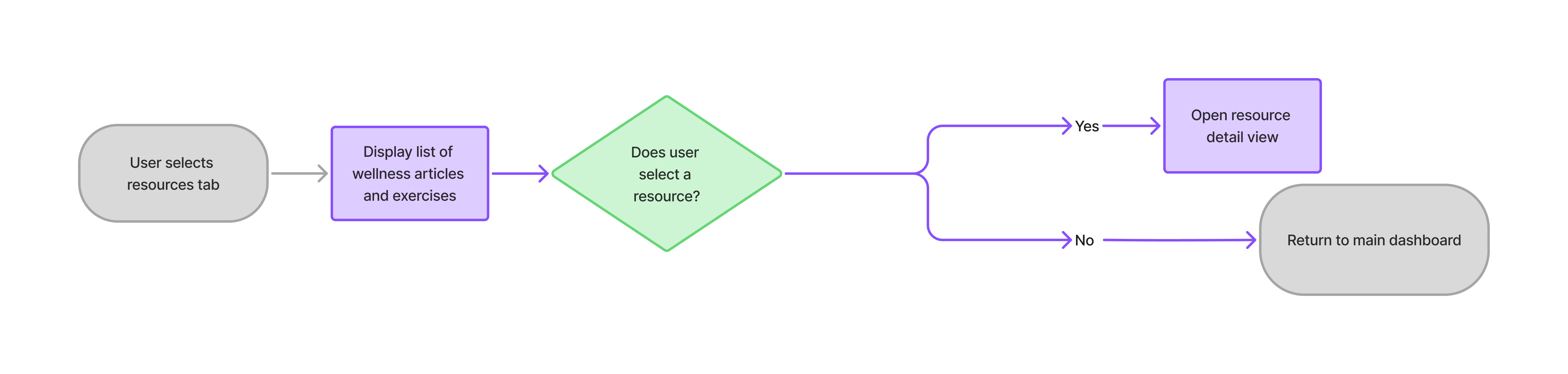
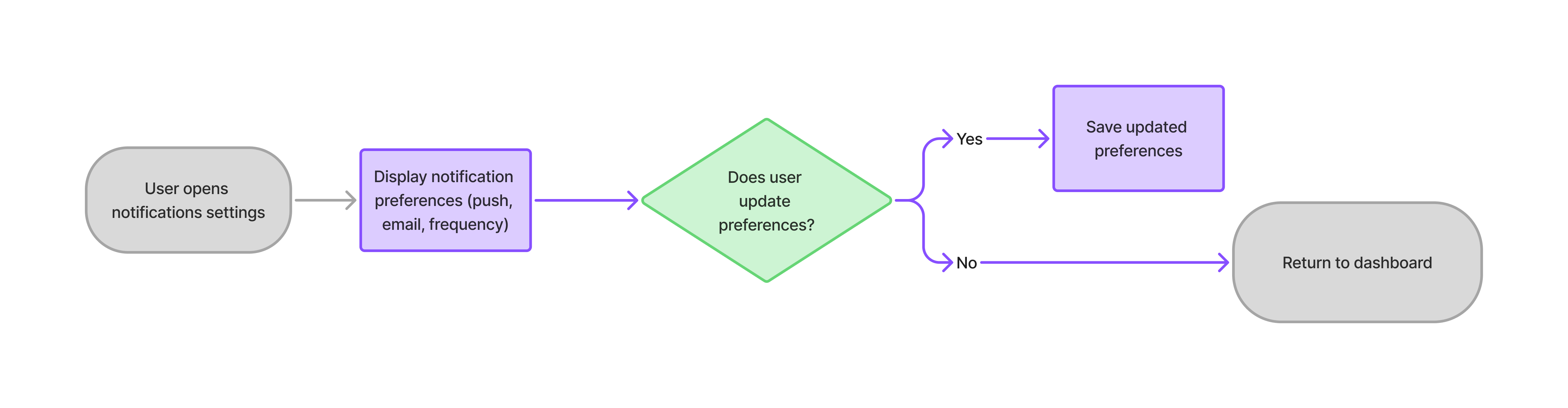
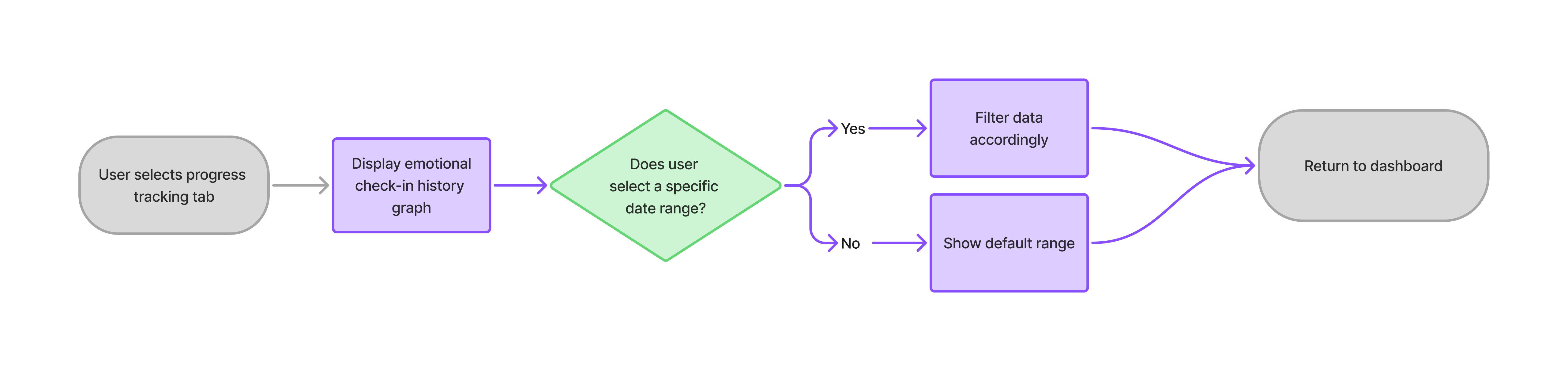
Information Architecture & Core Flows
The IA centered around four core moments: check‑in, insights, exercises, and journaling. This structure balanced simplicity with depth.


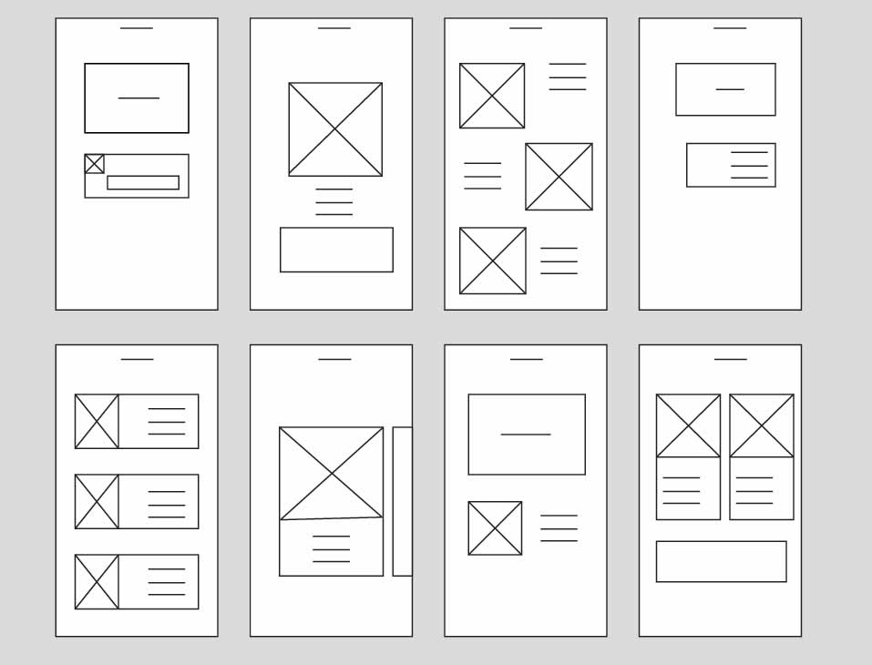
Wireframes
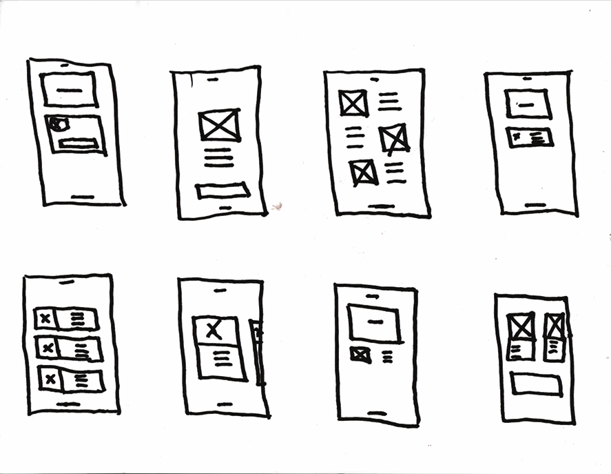
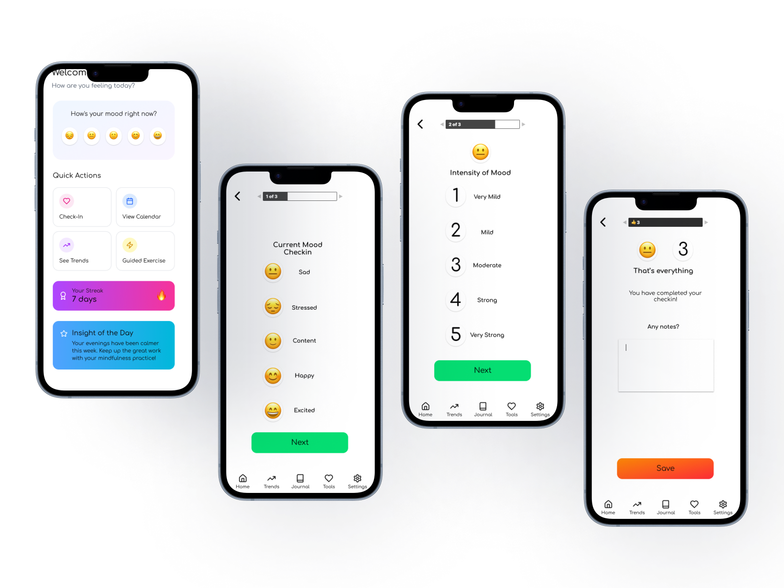
Early wireframes explored hierarchy, pacing, and how to keep the experience calm and approachable while reducing cognitive load.
.png)
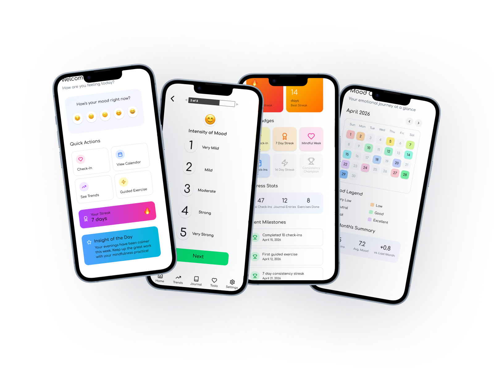
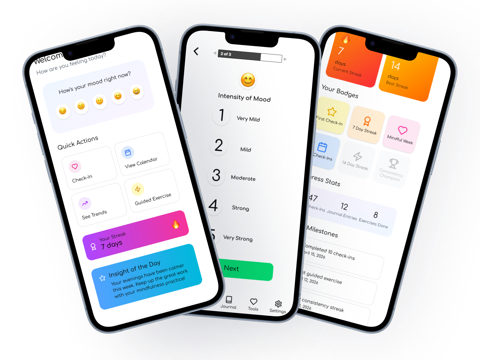
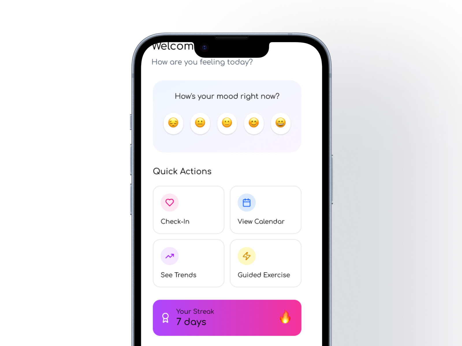
High‑Fidelity Design: Core Check‑In Flow
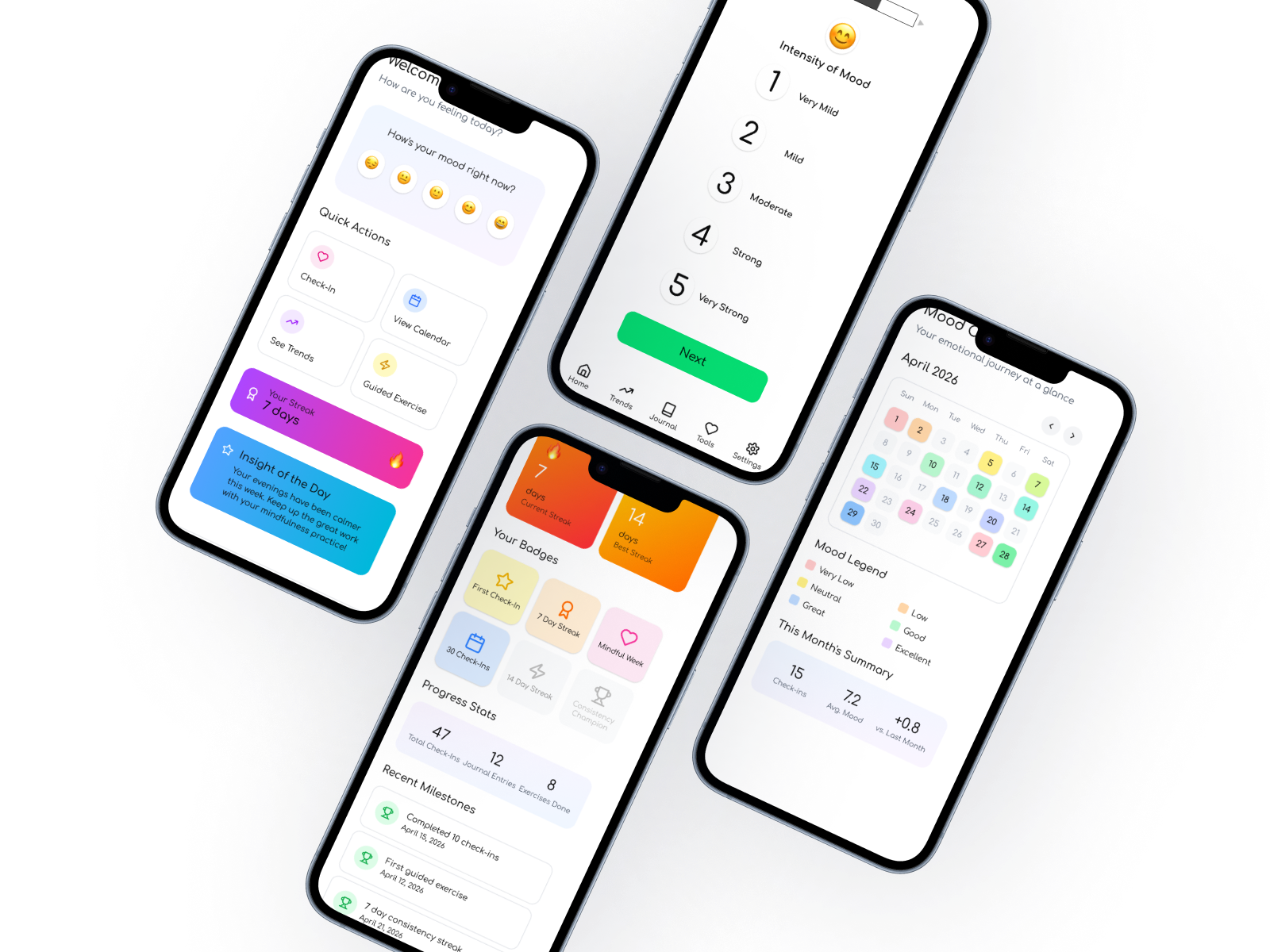
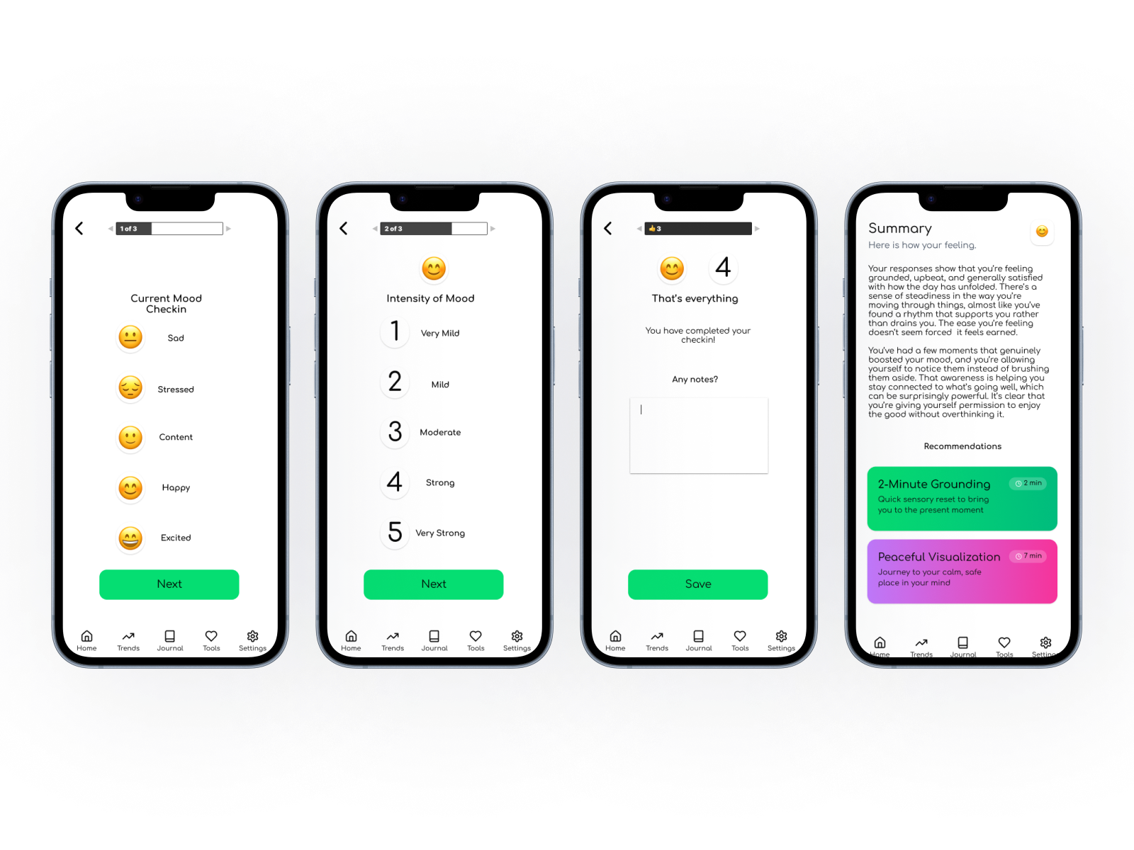
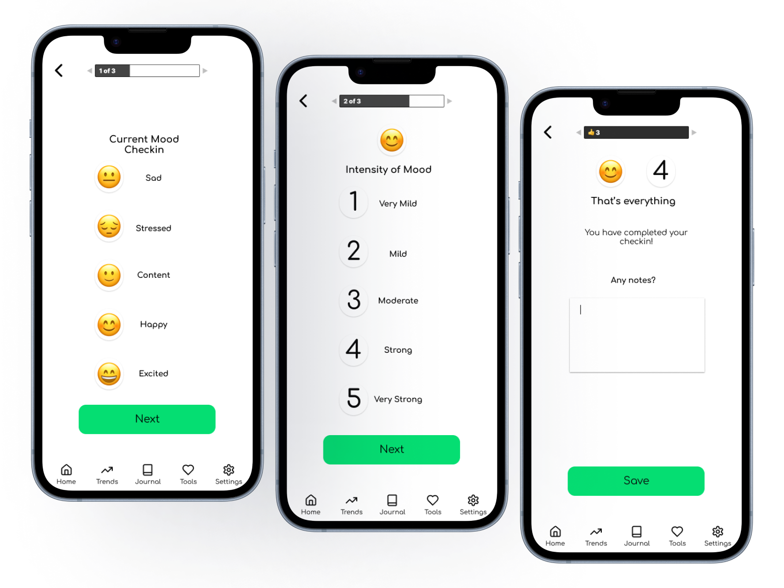
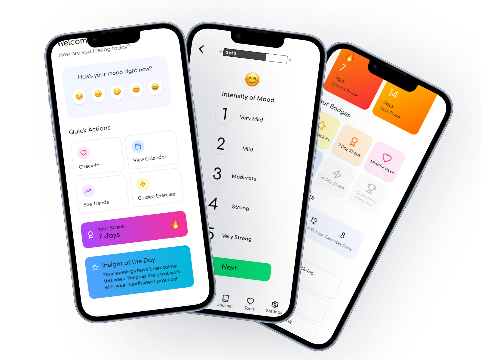
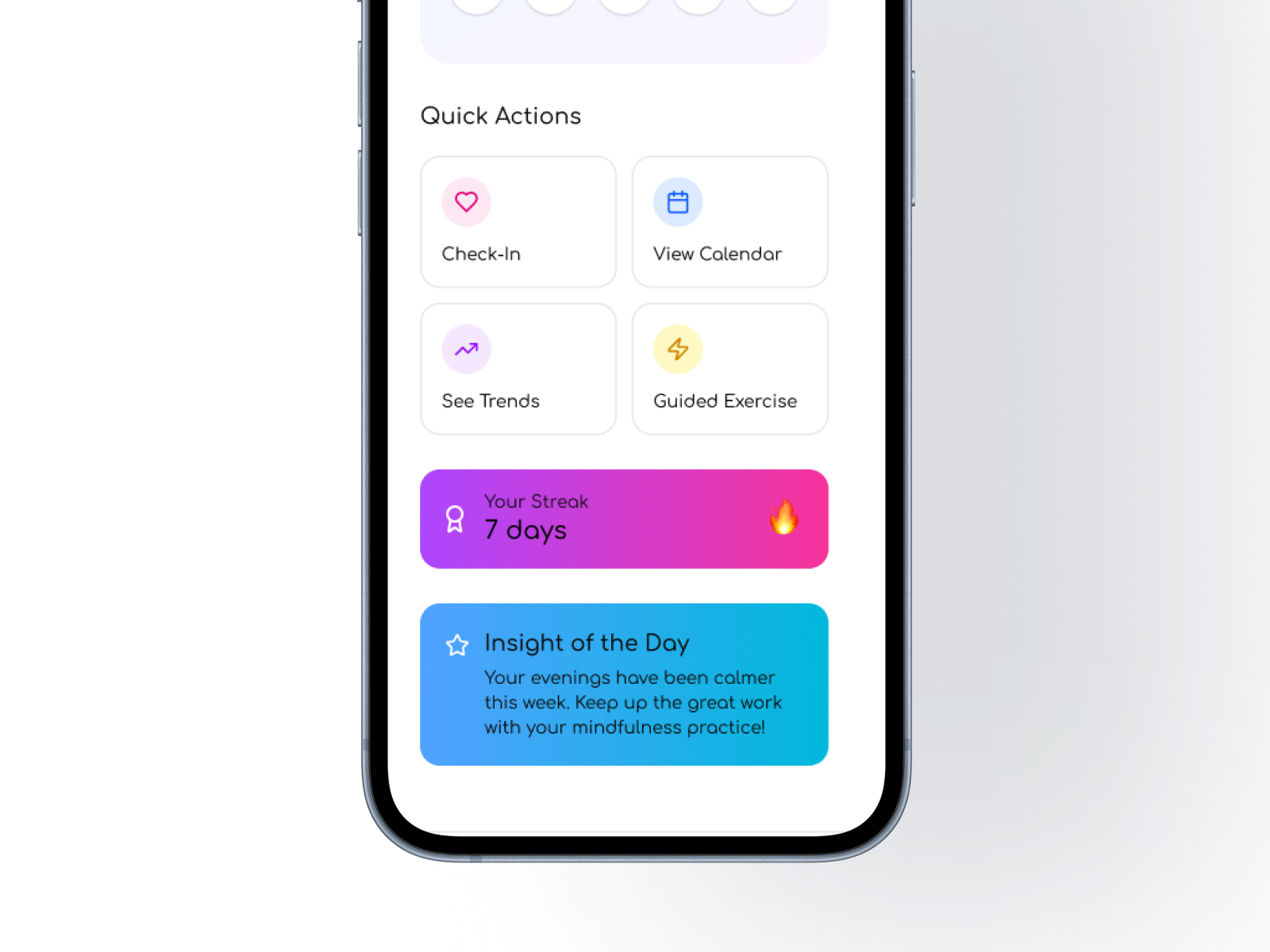
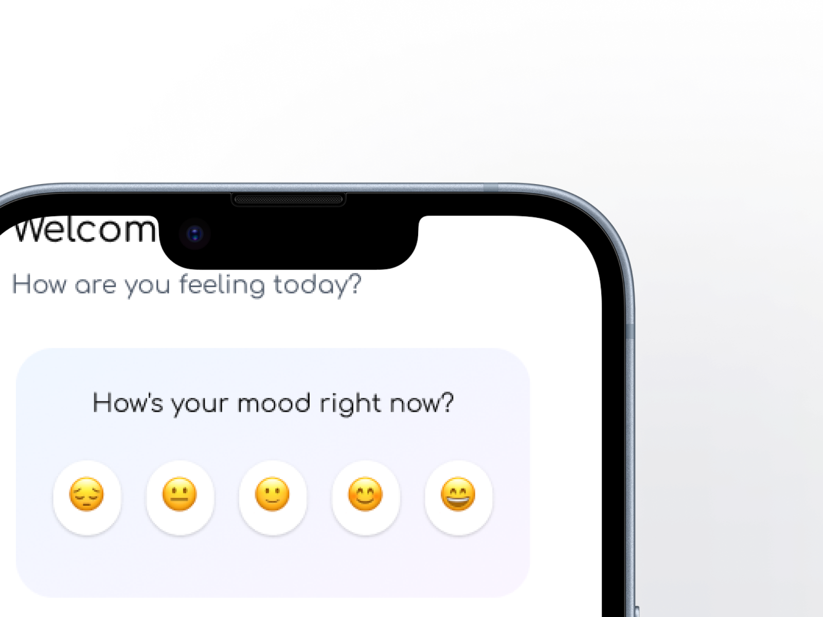
The visual language is intentionally soft and supportive: warm gradients, rounded shapes, friendly typography, and microcopy that feels human rather than clinical.
Coping Tools & Wellness Articles
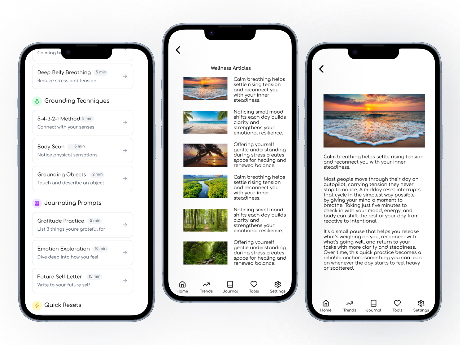
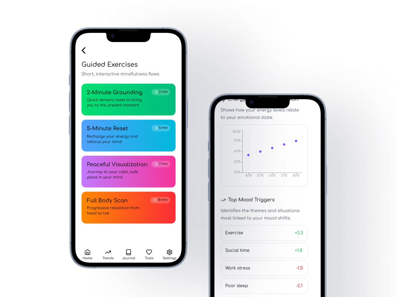
Research showed that users wanted more than mood logging — they wanted small, concrete ways to respond to how they felt in the moment. To support this, Mood Harbor includes a library of quick coping tools and short wellness articles designed to offer guidance without overwhelming the user. These resources are intentionally lightweight: grounding exercises, breathing prompts, reframing techniques, and one‑minute reads that help users understand their emotional patterns. Each tool or article is written in plain language and structured to be consumed quickly, making support accessible even on busy or stressful days.
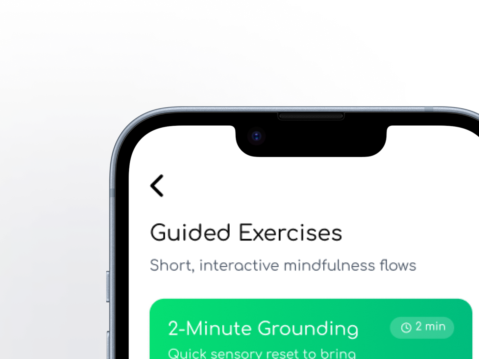
Guided Exercises & Supportive Content
Participants wanted more than logging—they wanted small, concrete ways to respond to how they felt. Mood Harbor includes short guided exercises and articles that meet users where they are.
Journaling
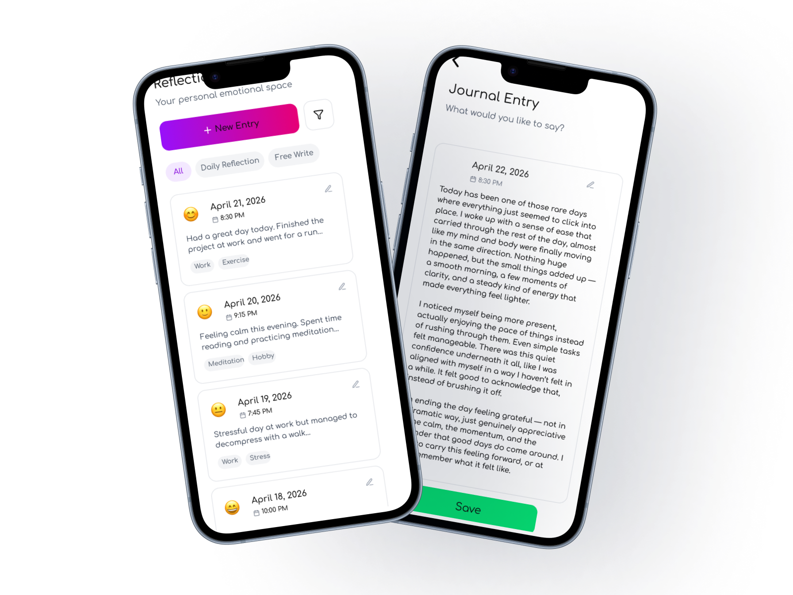
Journaling is optional but available for users who want deeper reflection, with tags and summaries to help surface themes over time.
Insights & Trends
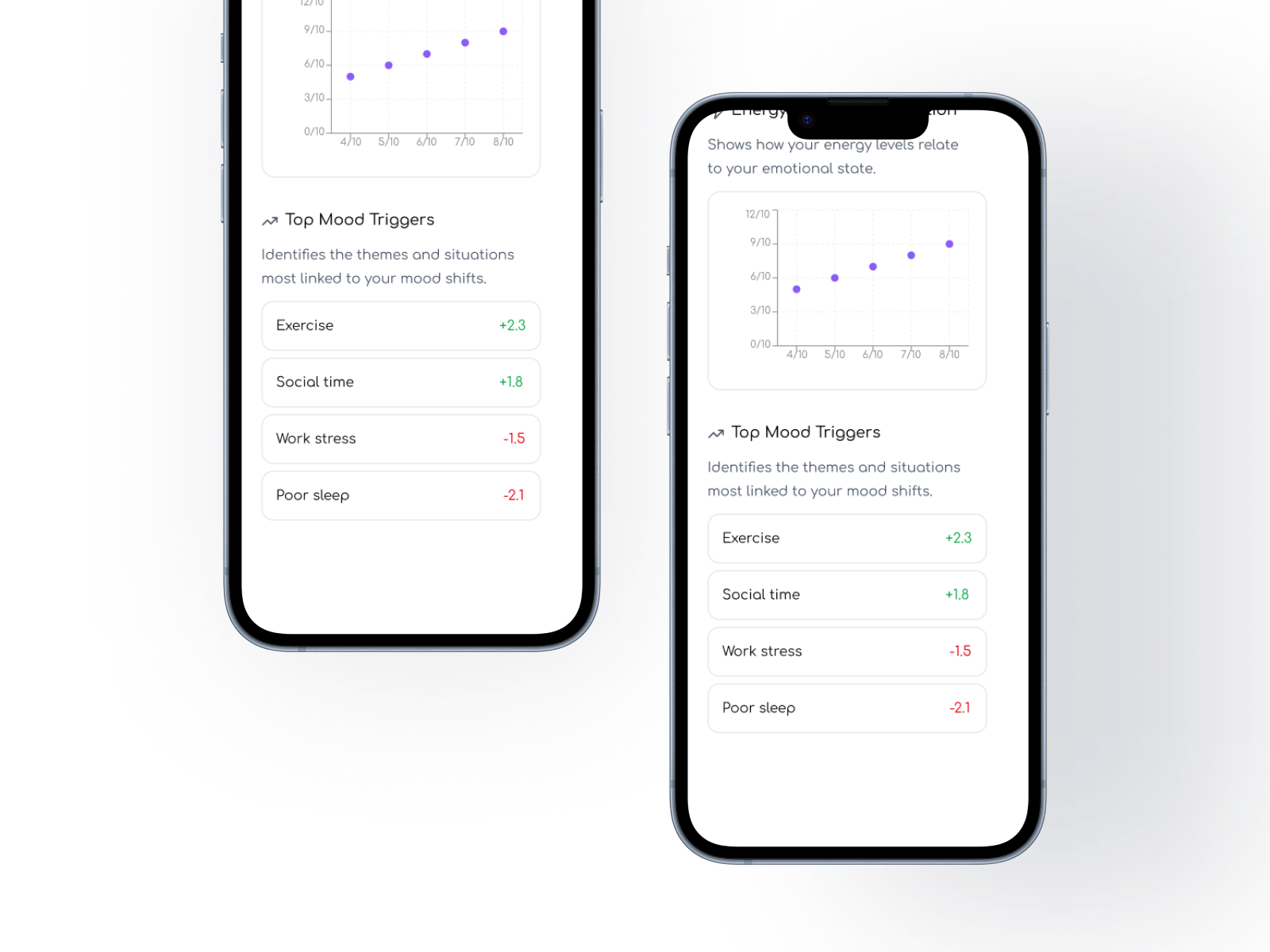
Insights translate emotional patterns into plain‑language explanations that help users understand how activities, routines, and triggers shape their emotional state.
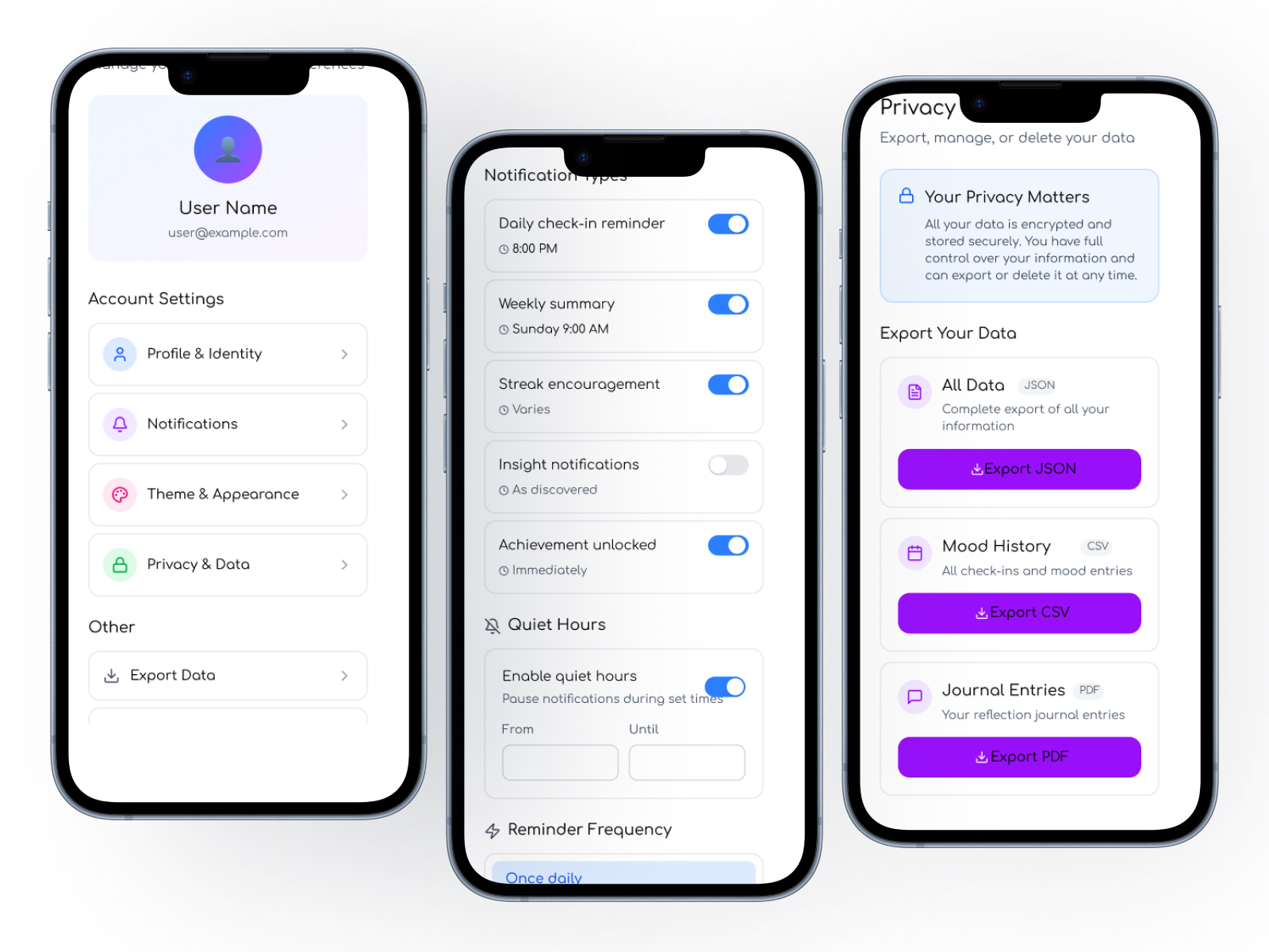
Onboarding & Settings
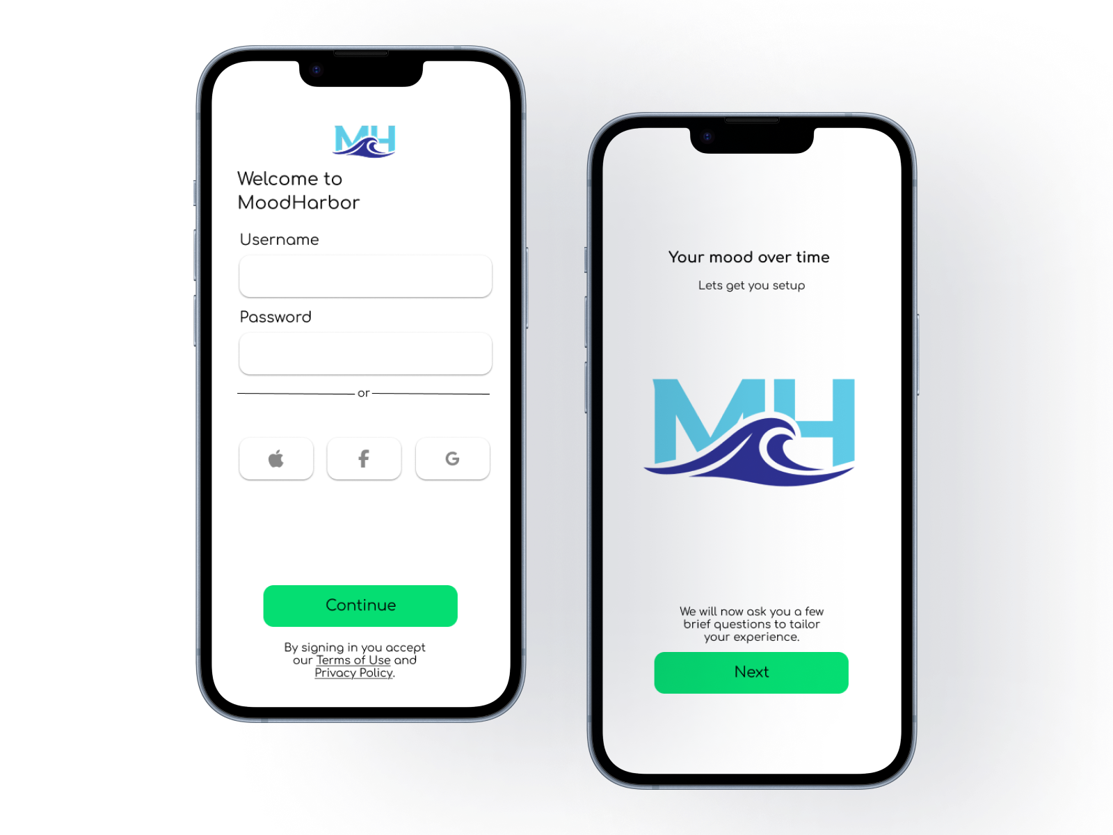
Trust and emotional safety were recurring themes in research. Onboarding, notifications, and privacy settings were designed to reinforce user control and transparency.
Additional UI States
Additional states and variations ensure the experience feels cohesive across edge cases and less frequent interactions.
Outcome
Mood Harbor demonstrates how research can shape not only features, but the emotional tone of a product. By grounding the experience in real routines and stress patterns, the final prototype supports quick, sustainable check‑ins that respect users’ time and emotional bandwidth.
This project strengthened my ability to conduct qualitative research, synthesize complex emotional data, translate insights into flows and interactions, and design with empathy and restraint.