
Young Blood
A brand that feels fearless needs a system that moves—on screens, in print, and in the details people actually touch.
Intent
When a brand has a loud personality, the job isn’t to make it louder. The job is to build a system that can handle energy without turning into noise. This case study focuses on clean hierarchy, repeatable typography rules, and motion that supports the message.
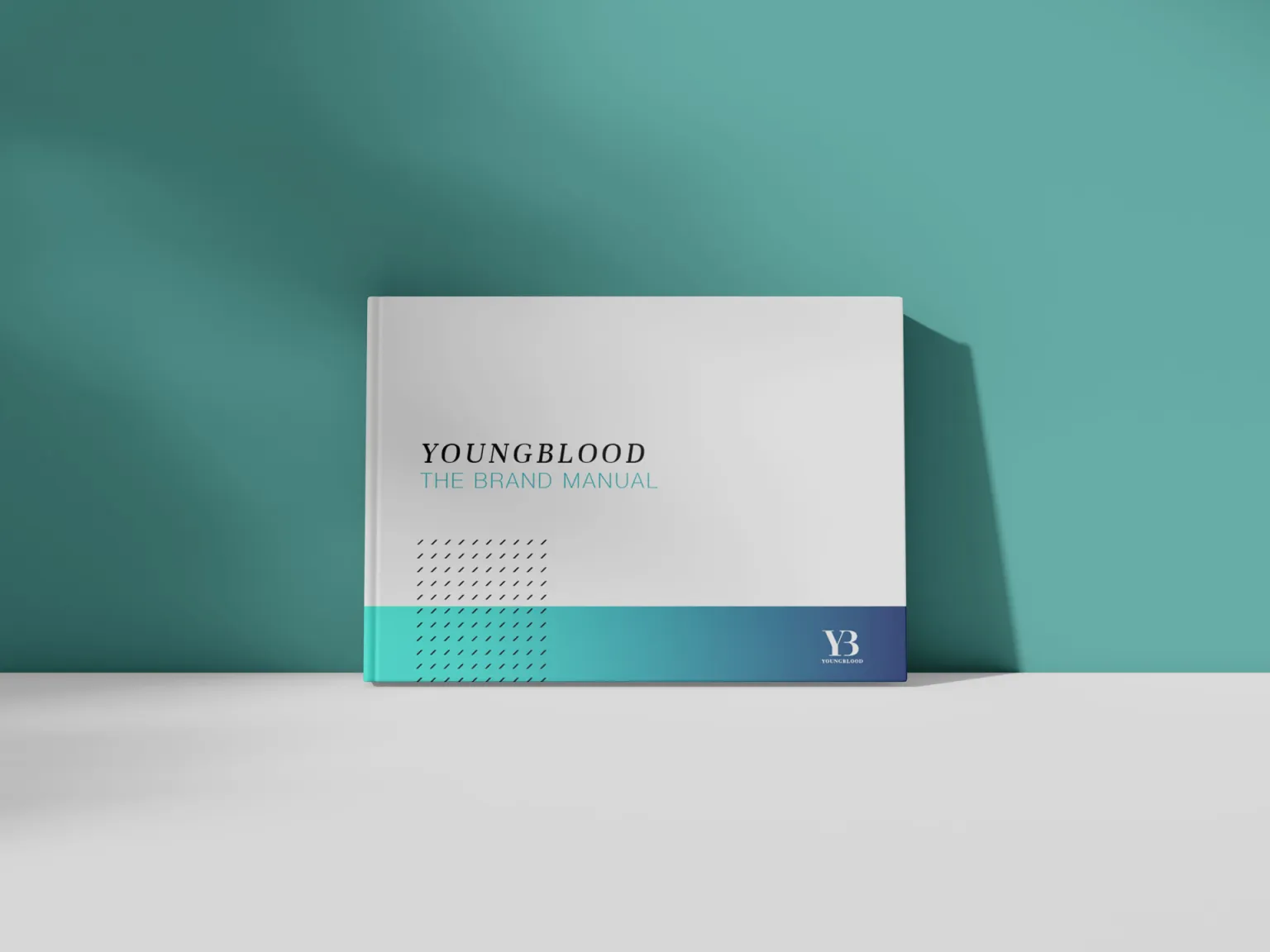
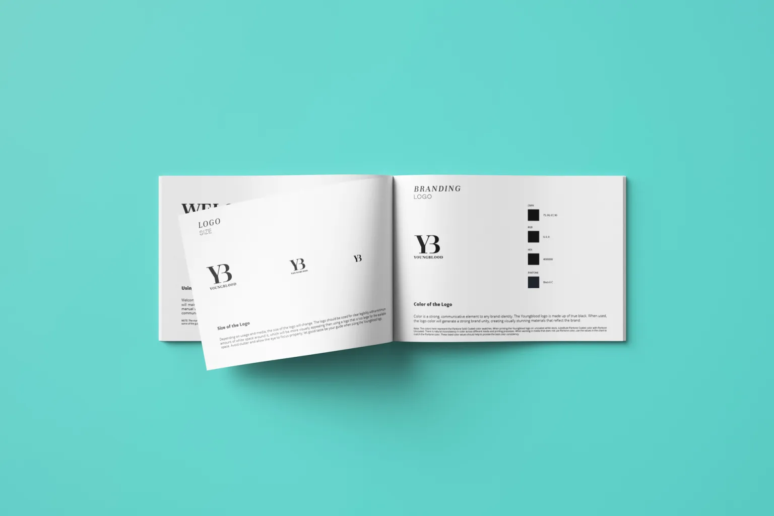
Digital experience
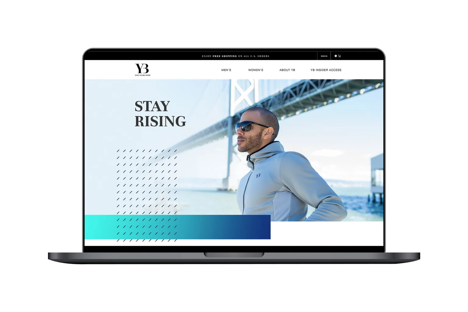
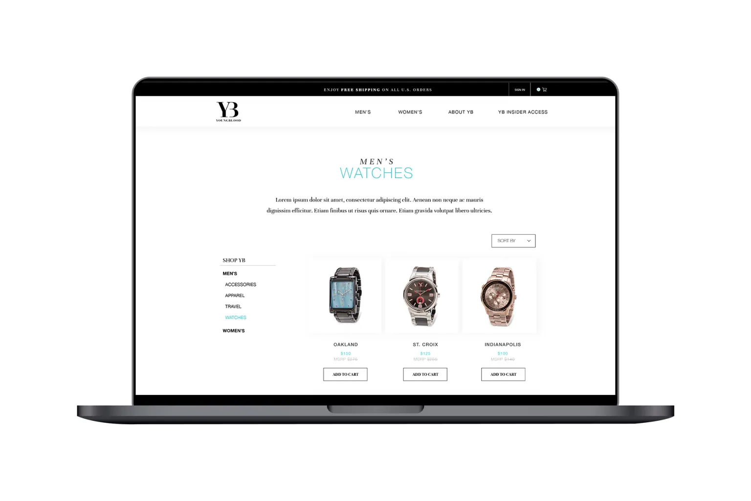
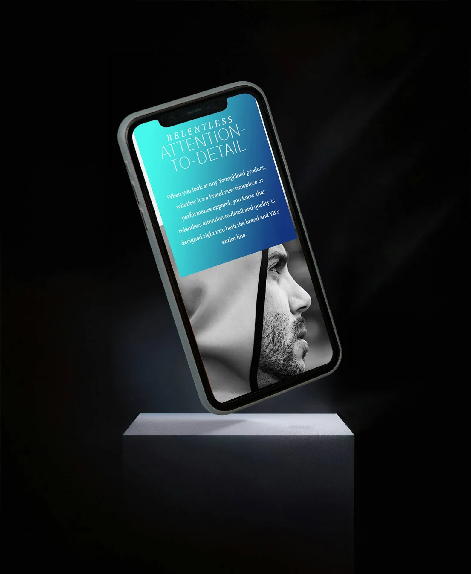
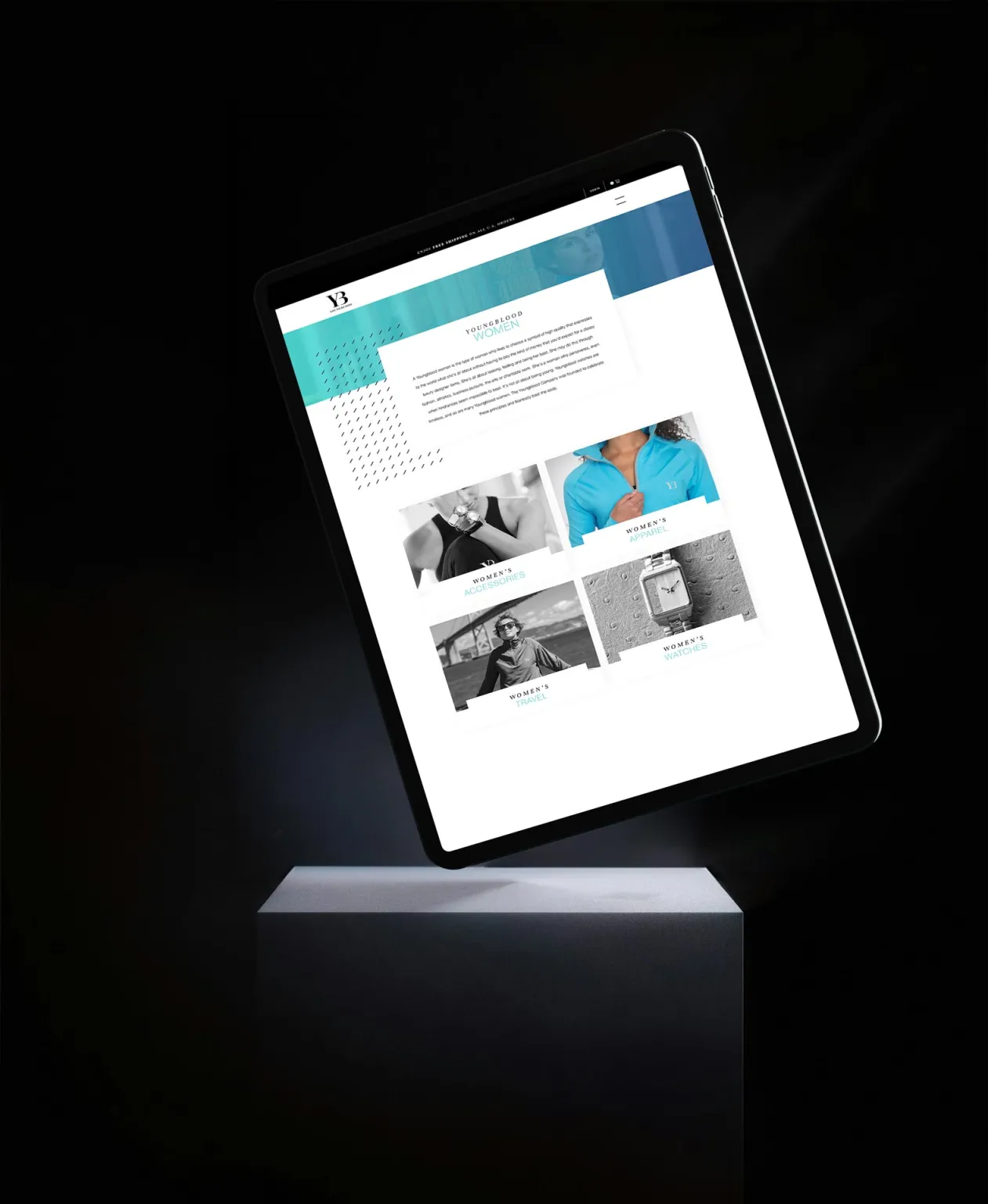
The UI leans into bold type and generous spacing so the brand can breathe. Product pages use consistent grids, repeated modules, and imagery that does most of the selling. The result is fast to scan but still feels intentional.
Campaign + physical touchpoints
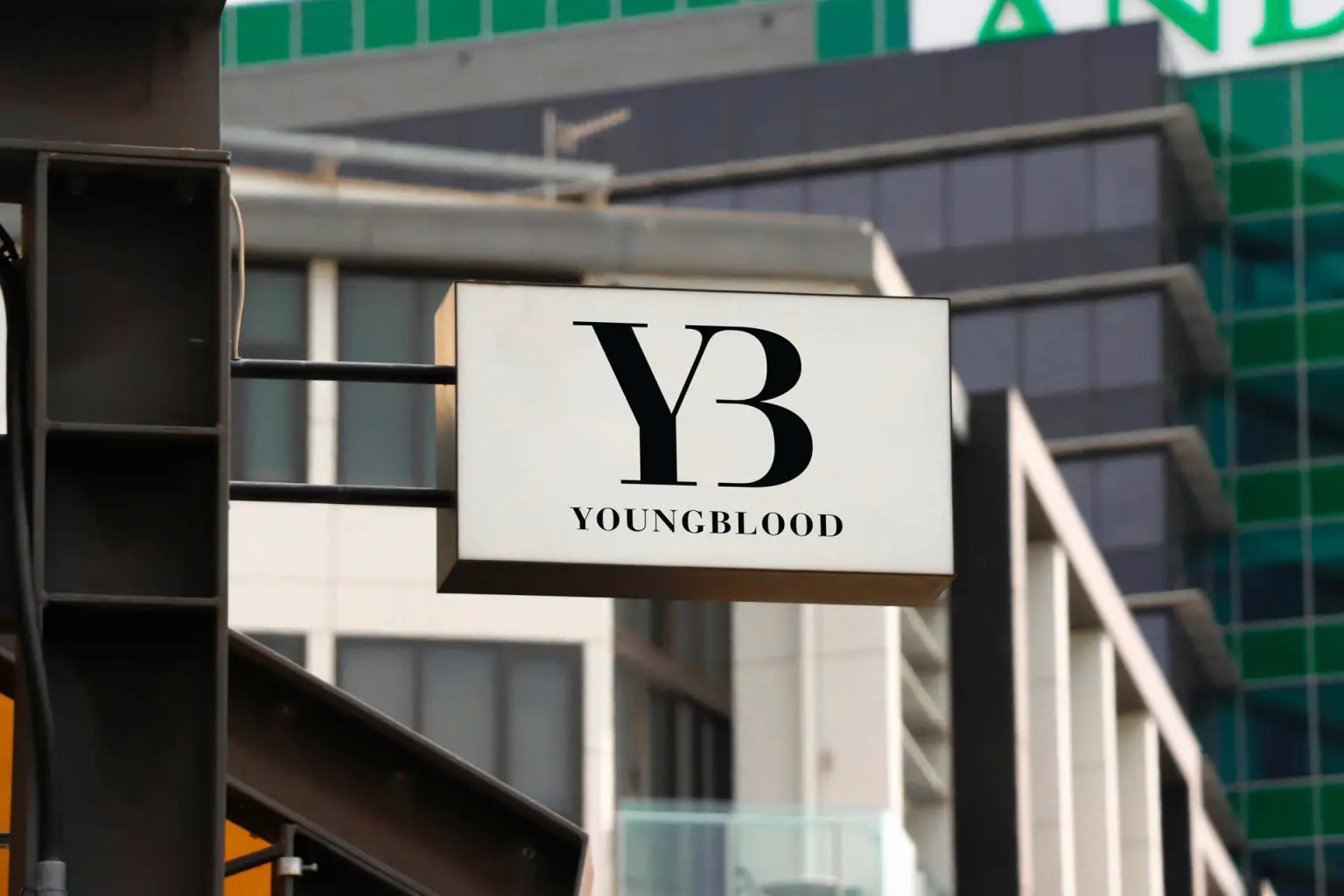
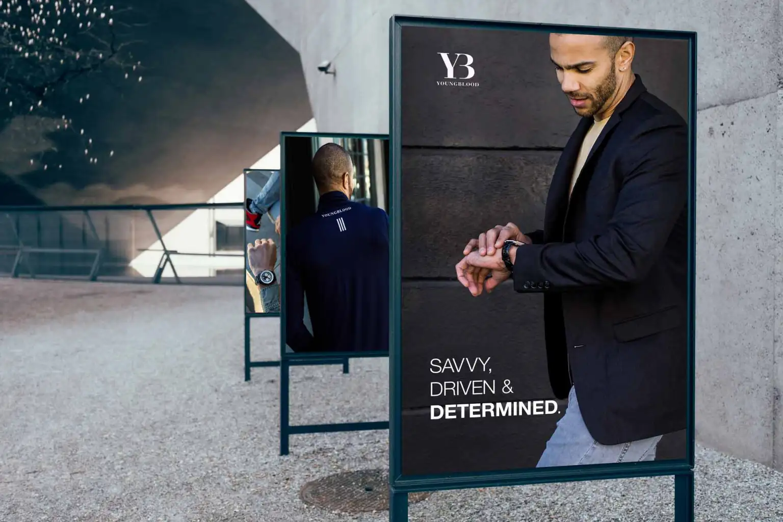
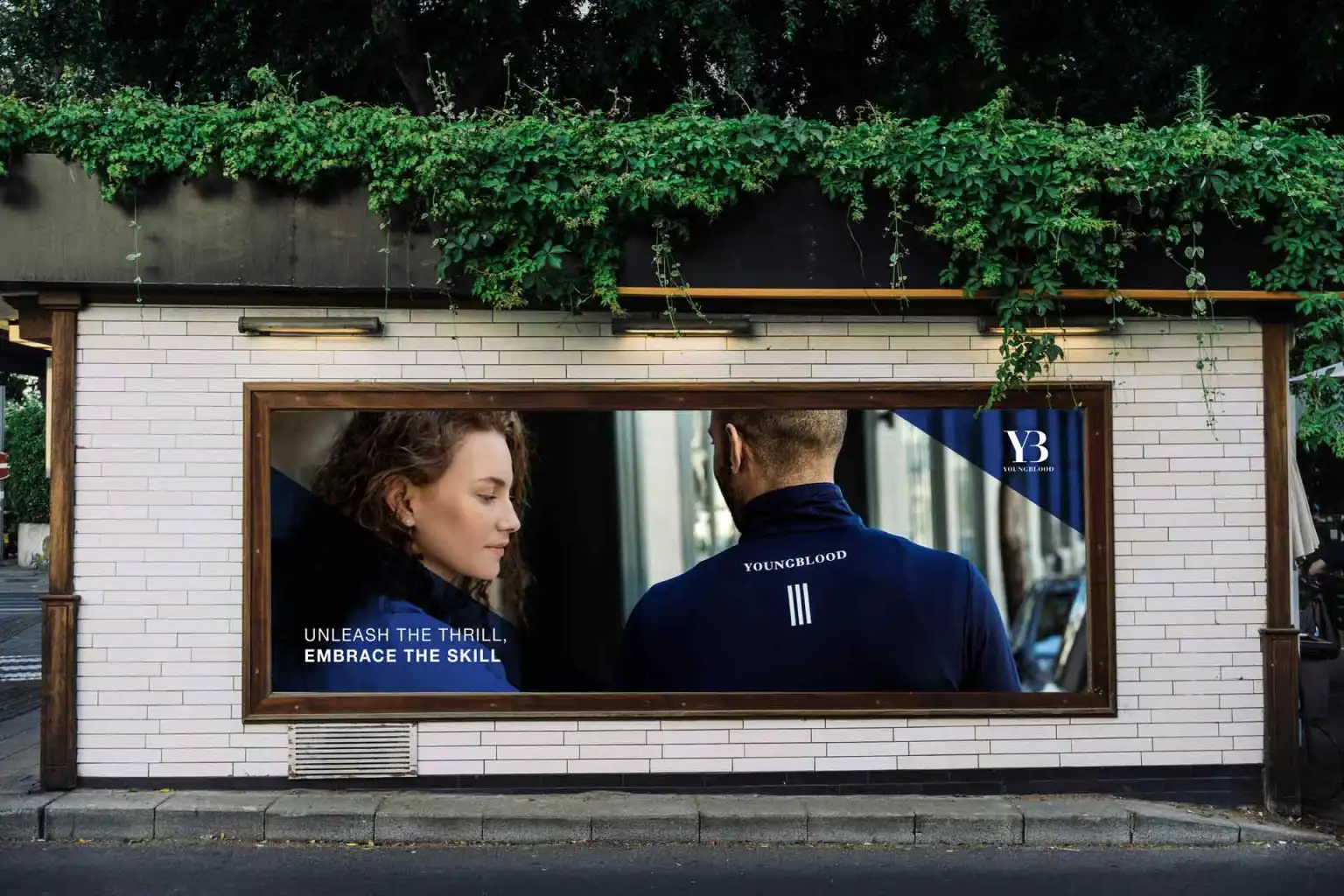
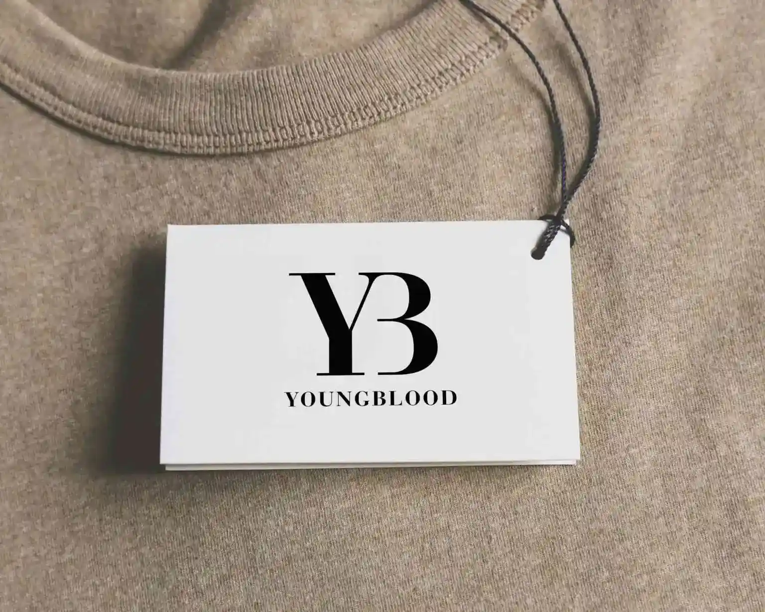
Print and environmental moments should feel like the same brand—just in a different material. These placements test legibility, contrast, and how quickly the message lands.
Outcome
The final system reads as bold but controlled. The work stays consistent across format: guide → interface → campaign → physical moments. That consistency is the deliverable.
Visual reference source: ArtVersion Young Blood showcase.